PUMP — Trading & Analytics Platform
The production application is part of a commercial, paywalled analytics suite, but you can get a good sense of its positioning and UI style from the public promo page: https://zenpulsar.com/solutions
PUMP is a trading/analytics product where I worked across both backend and frontend, focusing on performance, scalability, and a smooth charting experience for data‑heavy views. My main contributions were rebuilding parsers and data pipelines, optimizing MongoDB performance, and delivering advanced chart interactions in the UI.
Project Overview
PUMP aggregates market data, transforms it into analytics‑ready formats, and exposes it via APIs and interactive charts. The system needs to:
- Continuously ingest and process large volumes of market and sentiment data
- Serve responsive UIs for charts, lists, and dashboards
- Keep infrastructure and query costs under control as data grows
I worked as a full‑stack developer, owning features end‑to‑end: from ingestion and APIs to charting and UX details.
My Role and Responsibilities
Backend:
- Stack: Python / FastAPI / MongoDB
- Rebuilt Reddit and market data parsers to run faster and more reliably
- Designed and implemented API endpoints for charts, lists, and analytics views
- Added caching layers and query optimizations to keep responses fast
- Tuned MongoDB queries and indexes to handle growing datasets
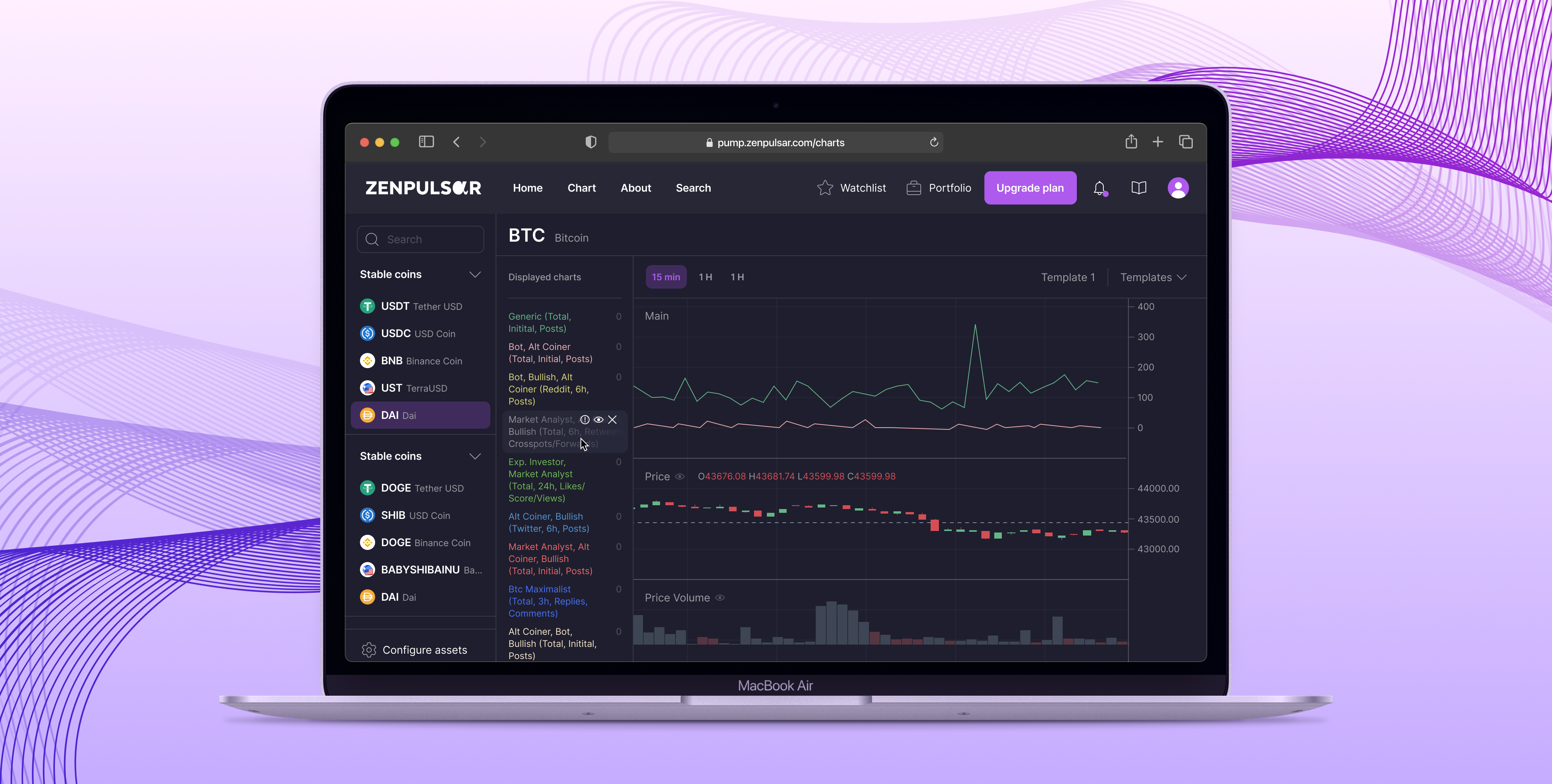
Frontend (Vue / Lightweight Charts):
- Implemented rich charting interfaces for signals, trends, and analytics
- Added advanced chart interactions for power users
- Optimized rendering for large datasets and frequent updates
Key Challenges
- Slow data ingestion and parsing
Existing parsers were written in a way that produced unnecessary bottlenecks (sequential calls, inefficient processing, repeated work). They struggled under higher load and made analytics data lag behind. - High latency on analytical queries
As data volume grew, MongoDB queries became slower, which hurt UX: longer load times for charts and dashboards, and occasional timeouts. - Heavy charts and large datasets on the frontend
Users wanted detailed, interactive charts with many data points, but naive rendering strategies led to jank, high CPU usage, and slow interactions on mid‑range devices.
What I Built
1. 5× Faster Parsers and Data Pipelines
- Rewrote the Reddit and market data parsers with a focus on:
- Parallelization / concurrency where appropriate
- Avoiding repeated work and redundant queries
- Efficient transformations using Python and Pandas/PyArrow where needed
- Integrated the parsers into an Airflow‑based pipeline with clearer DAG structure, retries, and monitoring
- Result: ingestion jobs went from roughly 120s to ~24s per run (about 5× faster), making analytics data much fresher.
2. Optimized MongoDB Queries for Analytics
- Audited critical queries used for dashboards and chart endpoints
- Identified slow patterns (e.g. unindexed filters, overly broad queries, unnecessary projections)
- Added and tuned indexes for high‑traffic query patterns
- Simplified query shapes and moved some pre‑aggregation to background jobs where appropriate
- Result: reduced p95 latency from about 800ms to ~220ms for key endpoints, making charts and lists feel significantly more responsive.
3. API Endpoints and Caching Layers
- Designed and implemented FastAPI endpoints to serve:
- Time‑series data for charts
- Aggregated metrics for overview dashboards
- Filtered/sorted lists for market instruments or signals
- Introduced caching (where consistency allowed) to:
- Reduce load on MongoDB for hot paths
- Smooth out latency spikes for popular views
- Added clear response models and validation to keep the API predictable and easy to evolve.
4. Advanced Chart Interactions in the UI
- Built charting views using Vue/Nuxt and Lightweight Charts tailored for trading/analytics use cases
- Implemented richer interactions, such as:
- Smooth zooming and panning on time‑series data
- Hover/crosshair behavior with synchronized tooltips
- Highlighting key signals or events directly on the chart
- Optimized the frontend for performance:
- Avoided unnecessary re‑renders with computed properties and memoization
- Used efficient data structures and downsampling where full resolution was not needed
- Result: users could explore more data with a smooth, responsive experience.
Impact
- Ingestion speed: ~5× faster parsers, significantly reducing data lag and improving the freshness of analytics.
- Query performance: MongoDB p95 latency dropped from ~800ms to ~220ms on critical endpoints, leading to noticeably faster page loads.
- User experience: richer, smoother chart interactions that made complex analytics easier to work with.
- Maintainability:
- Clearer pipelines and API boundaries
- Easier to reason about, debug, and extend both backend and frontend components
Tech Stack
- Backend: Python, FastAPI, Airflow, MongoDB, PostgreSQL, ClickHouse
- Frontend: Vue 3, Nuxt 3, Lightweight Charts
- Data & Tools: Pandas, PyArrow, Redis (for caching where applicable)
- Dev Practices: Type‑safe models, testing for critical paths, performance profiling and monitoring
PUMP is a good example of the type of work I enjoy most: owning features end‑to‑end, making data‑heavy products feel fast, and improving both system reliability and developer experience.